Digital Decadence: Can UI design ever hit the ultra-high-class-bougier-than-bougie-extraordinaire status?
I've rarely seen "luxury" used in the same sentence as UI design. What does luxury mean for digital products? Here’s my brain dump.

People often use "luxury" and "premium" interchangeably, but they aren't quite the same. "Premium" typically refers to high-quality products and services superior to normal market standards, but not necessarily unique or extremely exclusive. Think of a Mercedes-Benz E-Class. "Luxury," on the other hand, implies exclusivity, rarity, and symbolic value beyond mere practicality; consider a Rolls-Royce Phantom. Of course, what's considered premium or luxury can vary significantly based on a country's purchasing power and personal context. One person’s premium might be another person’s luxury. This article explores whether digital products that are inherently built for scale can ever embody luxury.
As a millennial, I'm from a generation of designers raised on minimalism, consistency, accessibility, and lean, fast, reliable experiences. I come from a school where stylised Dribbble shots were dismissed as disconnected from reality: beautiful, yes, but not pragmatic.
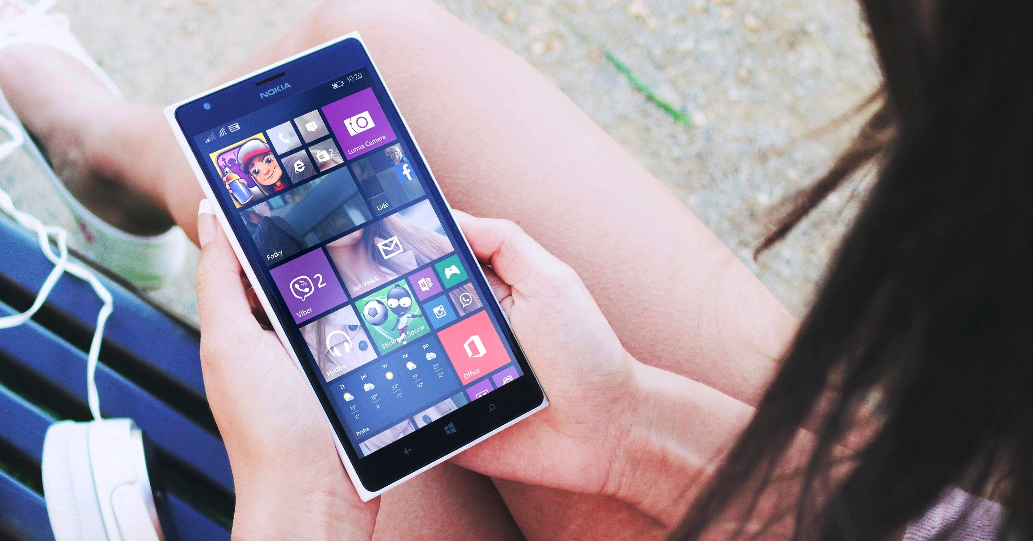
I remember thinking flat design was sleek when it first arrived. I was fascinated by the modular, sharp, boxy, and somewhat sterile look of the Windows Metro aesthetic. It was unlike anything I'd seen. It convinced me to buy a Nokia Lumia phone. It made me feel unique. I loved the flat colour palette and the big bold typography. Some saw it as a downgrade from Windows Vista's Aero. Metro ultimately failed due to unintuitive gestures, poor scalability, and clunky execution. However, the flat aesthetic gained momentum. Design systems became mainstream practice.
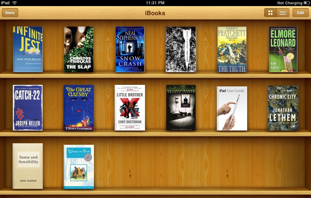
UI design today is at a turning point. The skeuomorphic era was quite cool. Dramatic, perhaps even silly to some, but emotionally engaging for sure. Over the years, minimalism and flat design became the dominant approaches, placing a lot of emphasis on simplifying visuals into basic shapes and colors. Rectangles with rounded corners became the staple ingredient of design. Accessibility and scalable design systems became a standard, especially with the rise of digital products for global audiences. The digital aesthetic of the last decade was shaped by cost constraints, limited processing power, linear logic, and slow internet speeds.. Along this path, we lost something vital.
Everything now feels predictable, safe, monotonous, and ultimately kinda boring.
But what if constraints weren't holding us back anymore? If we decided to push the boundaries of “digital deluxe”, where could UI design go? What could throwing a lot of money at UI design achieve today?
To understand what pushing these boundaries might mean, let's first consider what defines digital versus physical surfaces. Think about the digital "surface." It's flat, trapped under glass; it holds information and facilitates abstract tasks. Sure, we add animations, transitions, shadows, and other visual tricks, but ultimately it's still a faux 2D reality. It engages our minds but doesn't quite engage our senses.
In the physical world, a surface is about how something looks, feels to the touch, reflects light, ages, and wears. But physical surfaces don't hold information or facilitate tasks with the versatility and dynamism of a digital interface. The physical world has its limitations, just like the digital one.
Call it subconscious biophilia, but humans have a deep-rooted affinity for natural textures and forms. It's not that digital surfaces should mimic the physical world literally. Our perception of the physical world begins as abstract metaphors before becoming tangible sensory experiences. Think about the words we use: "smooth" can describe both physical textures and effortless experiences, while "rough" applies to gritty surfaces and challenging situations alike. Or consider how we call an interface "clean" when it feels simple and organised, or say a workflow is "fluid" when it moves naturally without interruptions. Our minds naturally create metaphors first, then apply them to sensory and abstract experiences alike.
So why the disdain for the synthetic? Instead of obsessing over emulating real-world textures perfectly, why not fully embrace synthetic abstract qualities and push their boundaries intentionally? The digital and physical worlds are connected by metaphors and abstractions. Perhaps the real innovation lies not in mimicking nature but in thoughtfully blending the natural and synthetic worlds, tapping into metaphors that resonate deeply with us as humans.
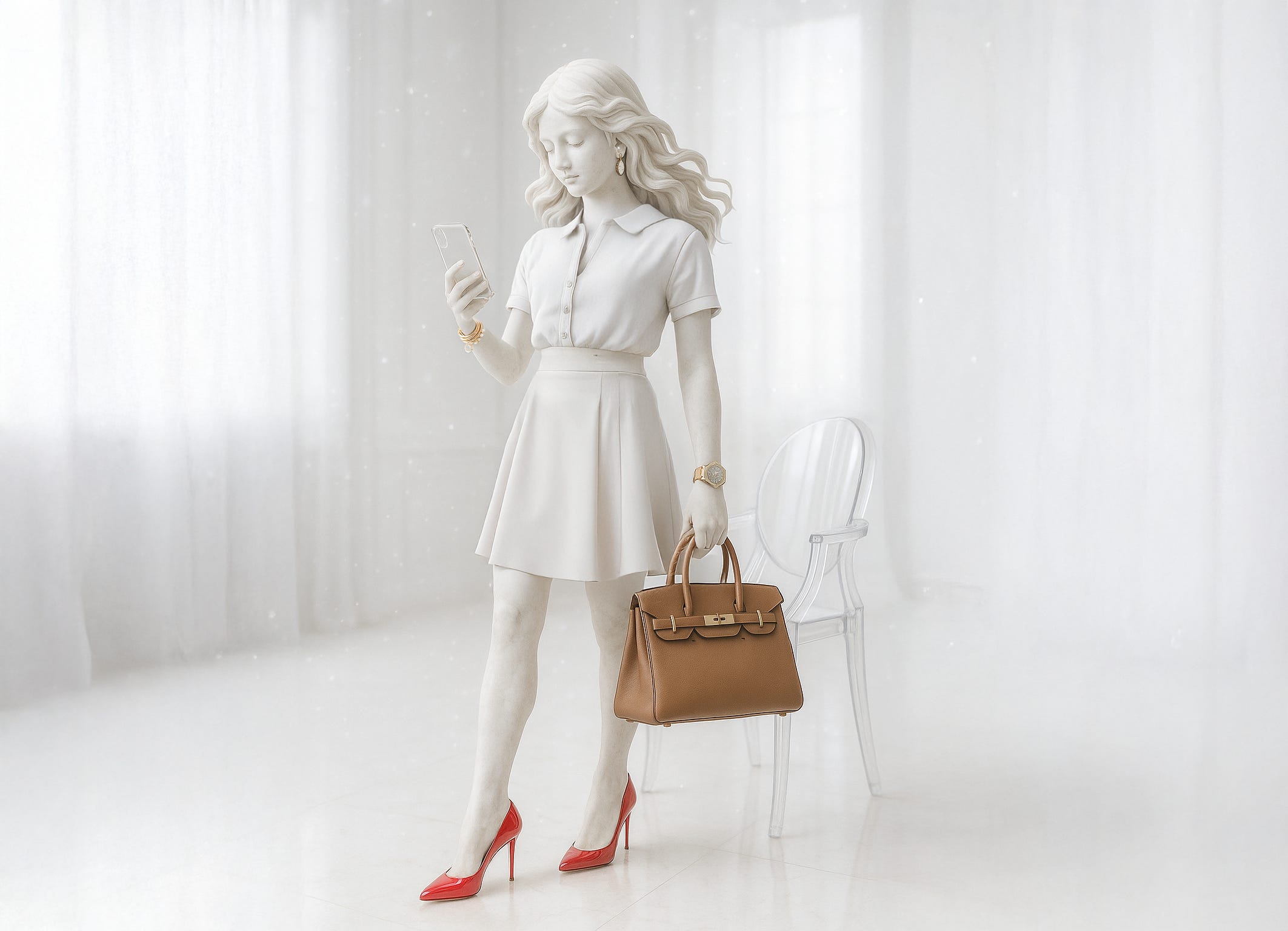
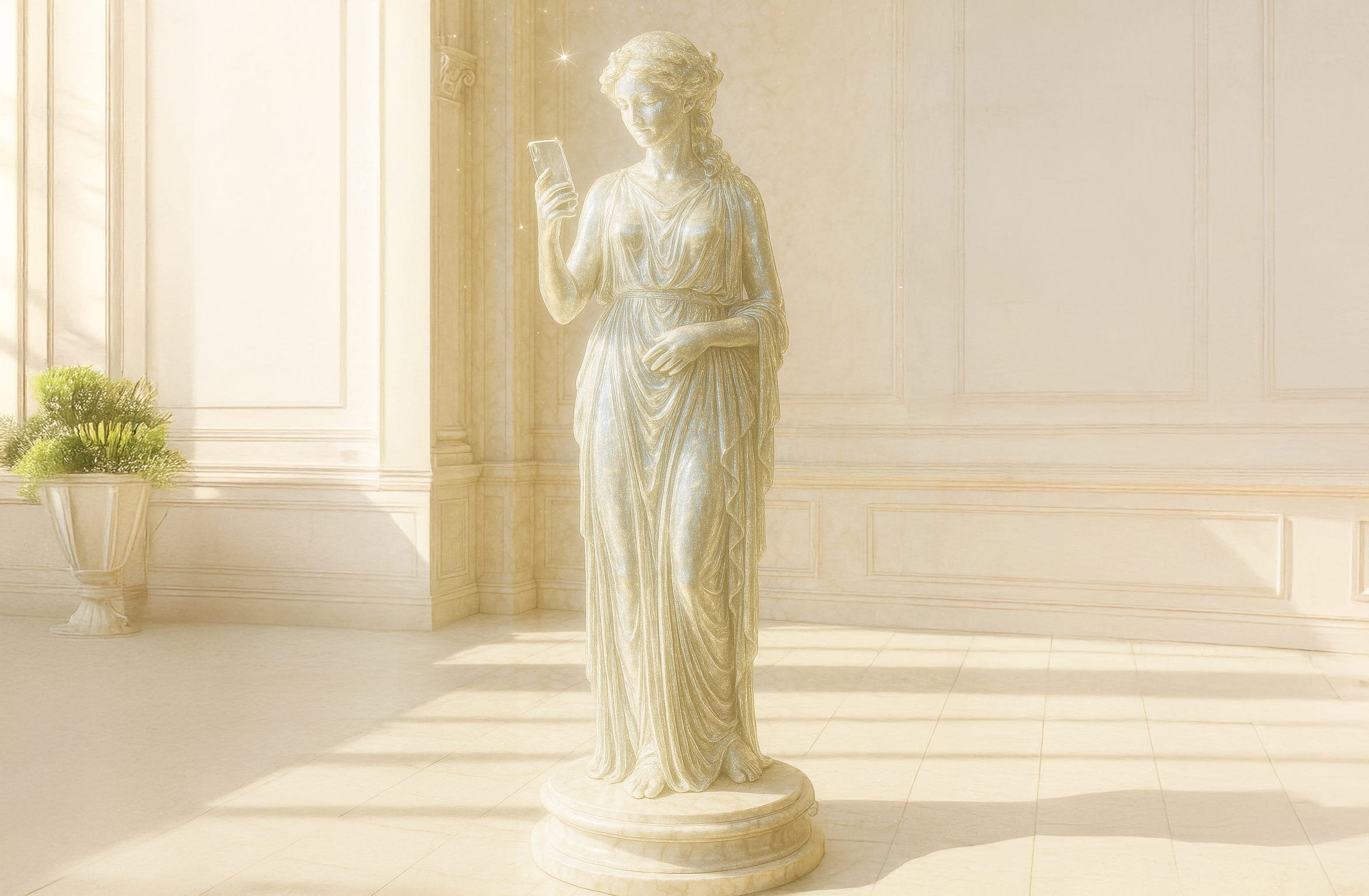
Back to the original idea.. what could “digital deluxe” be? Consider luxury physical products: a Rolex Daytona Paul Newman is not exactly standard gear for an airforce pilot. Louboutins aren’t everyday errand shoes. Philippe Starck’s iconic Louis Ghost chair, while visually striking, isn't designed for prolonged sitting comfort. Luxury often sacrifices practicality to signal exclusivity and status. Should this be the template for digital deluxe?
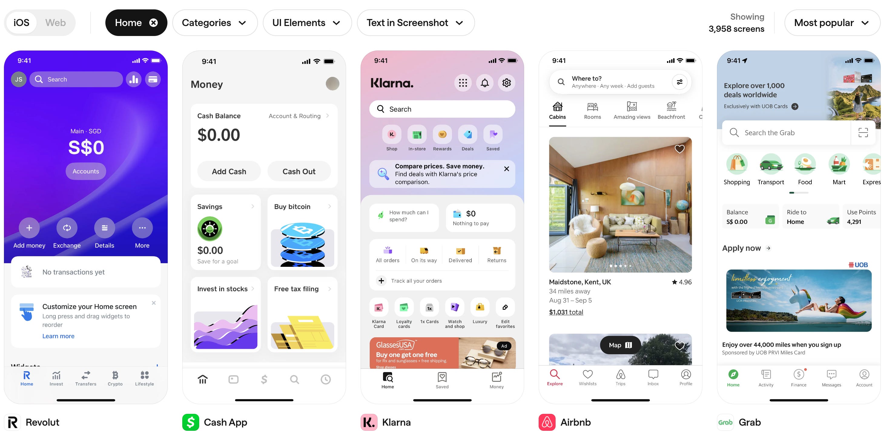
The most expensive software and apps today are likely to be specialised industry tools, enterprise data systems, fintech/trading softwares, or government and military applications. Unlike physical luxury products, digital interfaces are rarely as exclusive or limited to narrow contexts. At best, apps can strive to be somewhat premium if they offer superior service or a better user experience compared to the market standard. Yet most apps struggle to be premium because their design languages remain monotonous, predictable, and fail to rise notably above market standards. Given the scale at which apps operate, prioritising style over substance is rarely justifiable or sustainable.
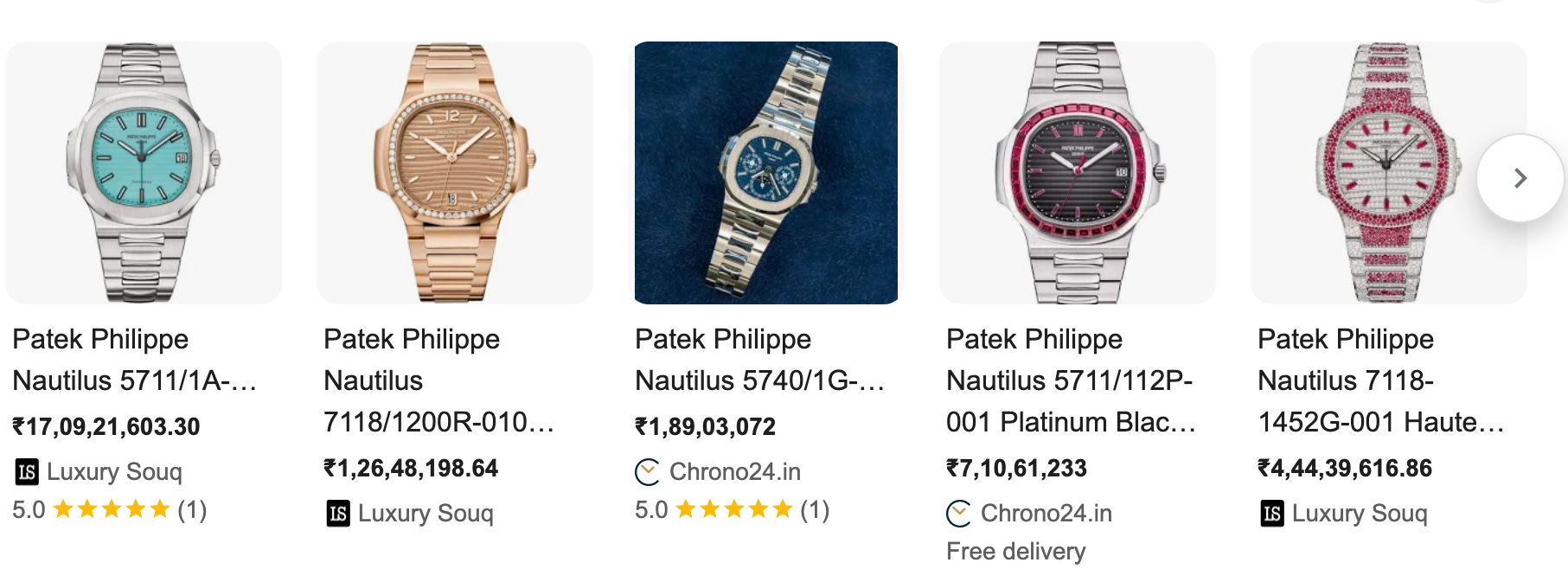
There's no real "premium" or "deluxe" tier in the world of software apps. Even if there were, it would mean serving hundreds of thousands, if not millions, of users. That's a far cry from the handful of people who’ll ever own a Hermès bag or a limited-edition Patek Philippe. Digital experiences, no matter how premium, can’t replicate the exclusivity of physical luxury. In a way, digital products are inherently anti-ultra-deluxe. Most apps make money from scale and not exclusivity.
There might be rare exceptions, such as exclusive dating or social apps targeting celebrities or ultra-high-net-worth individuals. However, these niche apps rarely scale significantly, and exclusivity alone seldom translates into substantial revenue or a even truly luxurious experience when it comes to digital apps.
Apple recently faced backlash for its "liquid glass" design language. It's bold and certainly stands out, but it isn't particularly novel or innovative. Apple has always positioned itself as premium at best, and the liquid glass aesthetic leans too heavily into style over substance. While prioritising style can sometimes be justified in luxury products, this aesthetic is neither premium nor luxurious. It lacks the exclusivity, originality, and uniqueness necessary to justify compromising usability. At Apple's immense scale, prioritising aesthetics at the expense of usability makes even less sense.
Mass-produced “cool” aesthetics quickly lose their charm, slipping from exclusive to annoying to kitsch within hours of using the product. The aesthetic is only part of it. True exclusivity hinges on scarcity, specialness, and an intangible sense of uniqueness. When something meant to signal exclusivity becomes widely accessible, it feels off. Apple's latest UI might unintentionally signal the onset of digital kitsch. With advancements like generative AI, technology could push creative boundaries in far more meaningful ways.
We're now free to imagine radically different possibilities. Imagine a UI surface organically adapting to each user's unique needs, tastes, moods, or context. Currently, it's still trapped under glass, holding information and facilitating tasks. But what if interactions and information felt tactile, responsive, and alive? Could an interface naturally evolve over time to become uniquely yours? Could a UI genuinely reflect individual uniqueness instead of treating everyone identically? Can we reclaim what we've lost—excitement, individuality, messy richness—and still keep it accessible? We've barely explored what tech can truly achieve in engaging our senses rather than mind. Does the ultra-deluxe-bougier-than-bougie UI really have to stop at layers of glass stacked upon more glass?
Fin